

Three partners, one solution: achieving flawless label application for Nectar Song

“By asking the right questions and applying deep knowledge of glass quality and label performance, we guided the customer away from semi-gloss and back to a textured paper that delivered both beauty and function.”
Steve Powell, Technical Liaison, Label Solutions
When three industry partners collaborated to solve a complex labelling challenge, the result was a premium finish that combined both form and function. The objective: to develop a visually striking, gold-accented label that could be applied seamlessly to glass bottles on a contract filling line. This case study demonstrates the critical importance of tailoring label materials and application processes to suit each customer’s specific requirements.
The brand: Nectar Song
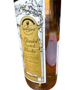
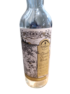
Nectar Song, a long-standing client, approached us with a request for a new label design for their premium Blended Scotch Whisky. The label was to feature a distinctive Pantone gold accent, and they sought our guidance on the best label material to maximise its impact.
We recommended a semi-gloss white paper, ideal for enhancing metallic print effects and giving the gold colour a vivid, luxurious finish. Historically, Nectar Song had used textured paper, which applied beautifully but lacked the visual brilliance that semi-gloss could provide for this specific gold tone.
However, after initial production and application tests, the semi-gloss material presented unforeseen challenges during the bottling process—prompting a deeper investigation.
The filler: Young Spirits
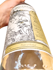
Young Spirits, an experienced contract filler, manages bottling, labelling, and packaging for a wide range of spirits. They received the semi-gloss labels for application on their glass bottles. Unfortunately, the labels did not conform well to the glass surface—leading to misalignment, creasing and visible imperfections.
Diagnosing the issue: asking the right questions
When Young Spirits raised their concerns, our team acted quickly. The issue wasn’t with the label design or print quality, but rather the interaction between the semi-gloss paper and the subtly uneven glass bottle surface.
Steve Powell, our Technical Liaison Manager, drew on his extensive expertise to collaborate closely with both Nectar Song and Young Spirits. His thorough analysis revealed that the semi-gloss material lacked the flexibility required for a clean application on these specific bottles.
The solution: a return to textured elegance
Our recommendation was to return to a premium textured paper—previously used successfully by Nectar Song. This material not only offered better adhesion and flexibility, but its thicker composition also helped mask minor inconsistencies in the bottle’s surface. The result: a smoother, more consistent application with a refined, rustic gold appearance.
Outcome: seamless execution through collaboration
Thanks to open communication, collaborative problem-solving, and technical insight, we helped Nectar Song achieve a label that met both visual and practical expectations. This project is a prime example of how a label supplier, a contract filler and a brand can work together to turn production challenges into standout success.
“I will continue to print labels with you.”
Song, Nectar Song